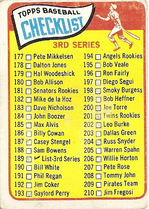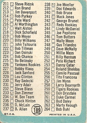
Now to the aesthetics. I really dig the classic graphic in the top right corner of the hitter watching the flight of the ball as he prepares to drop his bat and run the bases. I also love the abbreviation of "checklist" to include the visual symbol of a check mark. Like all good checklists, this one is covered in little pencil marks, though it looks like someone tried to erase many of them. Needless to say, these pencil marks do not represent my own collection. By my count, I now have sixteen of the eighty-eight cards listed, or 18.1%. We're really starting to make some headway in completing the set!


I am mesmerized by the recursive nature of this card. It's wacky to me that they this the card itself, #189, on the card itself. They printed on a check mark, but why didn't they put the check mark IN PLACE OF the white check box, instead of next to it? I like how somehow did in fact mark the check box. I guess every time a kid got one of these checklists out of a pack, he needed to go ahead and mark its self-referential box right away.
ReplyDelete